 Your Date'S Dress 1")
Coordinating your prom suit with your date’s dress doesn’t require a fashion degree or hours of research. This guide breaks down exactly which prom suit colors work with which dress colors, explains the simple color theory behind great coordination, and gives you a practical chart you can reference in minutes. Whether her dress is dusty rose, emerald, or something you’ve never heard of, you’ll know exactly what to wear.
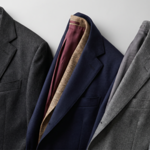
TLDR: Start with a neutral suit (navy, charcoal, black) that flatters your skin tone. Coordinate through accessories (tie, pocket square, boutonnière) in your date’s dress color. The 2026 rule: coordinate, don’t copy. Exact matching is out; intentional accent coordination is in.
Jada just texted Marcus the name of her dress color: “dusty rose.”
Marcus stares at his phone. He has no idea what dusty rose looks like. He Googles it. It’s… pink? Sort of? A muted pink? He starts to panic. Does he need a pink suit? A pink tie? Will he look ridiculous standing next to her in some color he can’t even pronounce?
Then he finds this guide and discovers the answer is much simpler than he feared. His charcoal suit works perfectly. All he needs is a dusty rose tie and a coordinating pocket square. The suit stays classic. The accessories do the coordination work.
He goes from “I have no idea what I’m doing” to “I know exactly what to buy” in five minutes.
That’s exactly what this guide will do for you.
The Big Rule: Coordinate, Don’t Copy
Here’s the most important thing to understand about prom coordination in 2026: exact matching is out. The biggest trend this season is coordinating with your date, not copying their colors.
Widely cited research from the Institute for Color Research suggests that 62-90% of a person’s initial impression is based on color alone, and that assessment happens within 90 seconds. Your color choices matter more than you might think.
Why coordinate instead of match? Three reasons:
Fabric differences make exact matching nearly impossible. Her dress fabric and your suit fabric absorb and reflect light differently. Even if you buy the “same” color, they won’t look identical in photos. The slight difference reads as a mistake rather than intention.
Coordinated looks are more sophisticated. When your tie echoes her dress color against a neutral suit, it looks intentional and polished. When you’re both wearing the same color head to toe, it looks like you’re in costume.
You both get to look your best. Research shows that dress fundamentally shapes how others perceive you, so choosing colors that flatter you individually matters as much as coordination. Matching means you’re both compromising to achieve sameness.
The formula that works for 90% of couples: neutral suit (navy, charcoal, black, gray) plus accessories (tie, pocket square, boutonnière) in her dress color or a complementary shade.
Color Theory Made Simple: Three Methods That Work
You don’t need to understand complex color theory. These three methods based on color theory and clothing coordination principles cover every prom coordination scenario.
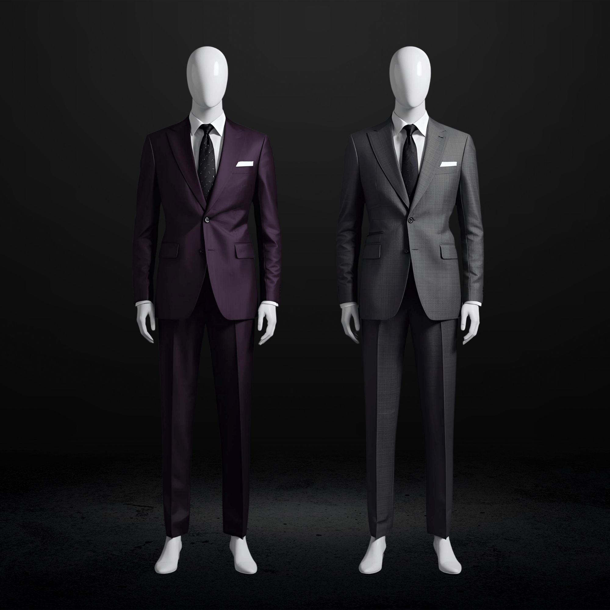
Method 1: Complementary Colors (Bold, High Contrast)
Complementary colors sit opposite each other on the color wheel. When paired, they create vibrant, eye-catching contrast.
The main pairs:
- Red ↔ Green
- Blue ↔ Orange
- Yellow ↔ Purple
Best for: Couples who want to make a statement. Confident dressers who embrace bold choices.
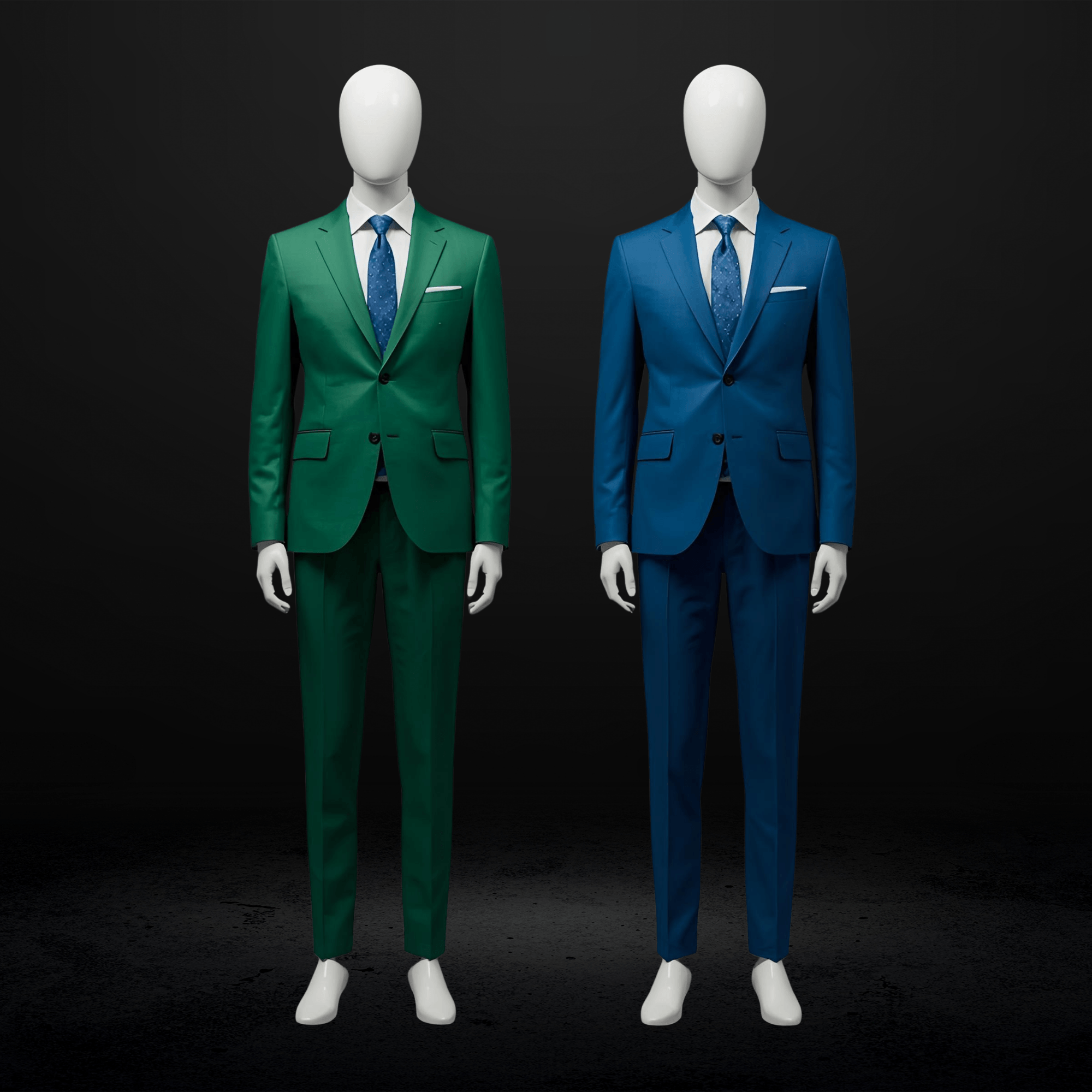
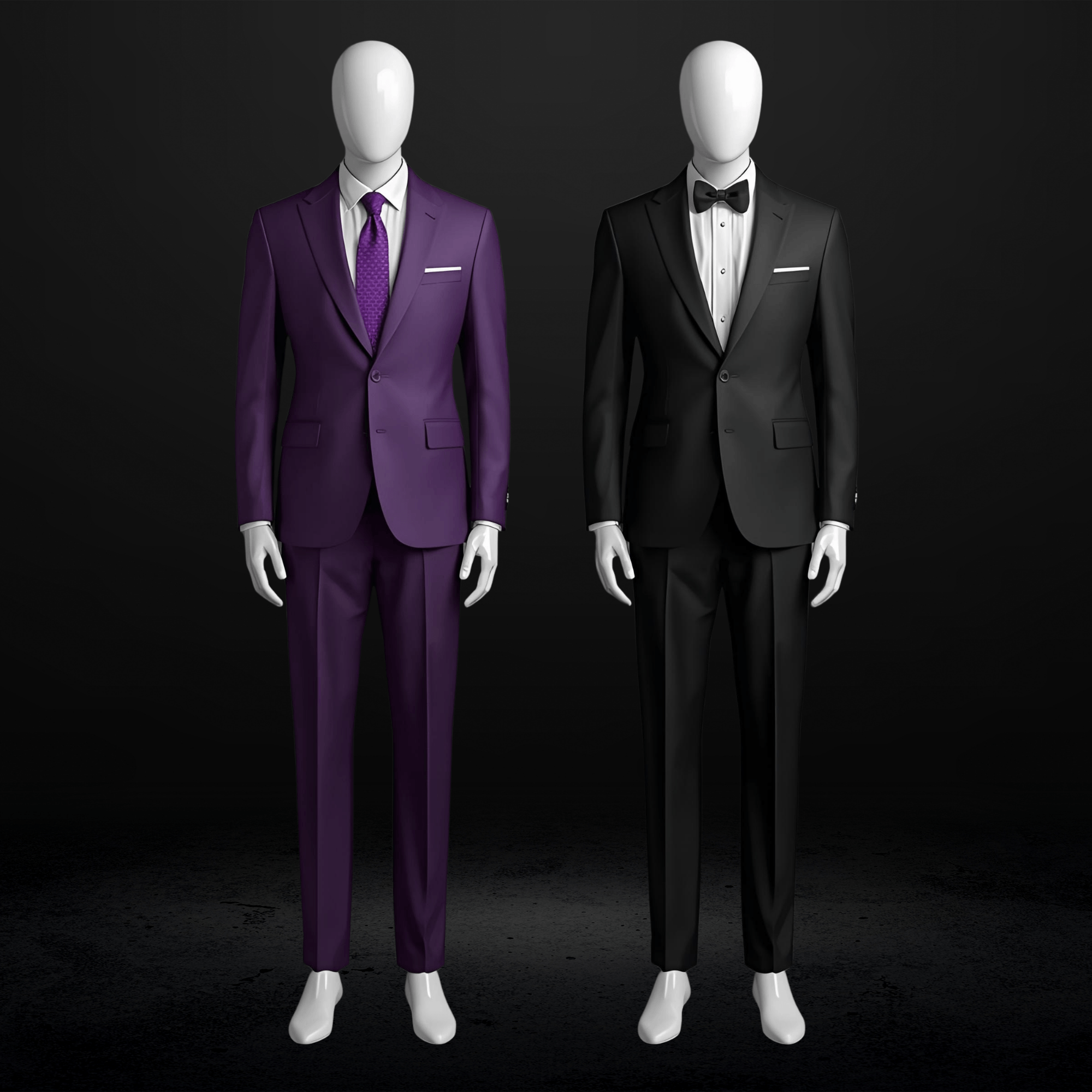
Prom example: Her emerald dress with his navy suit and burgundy tie. The burgundy (red family) complements the green, creating visual energy.
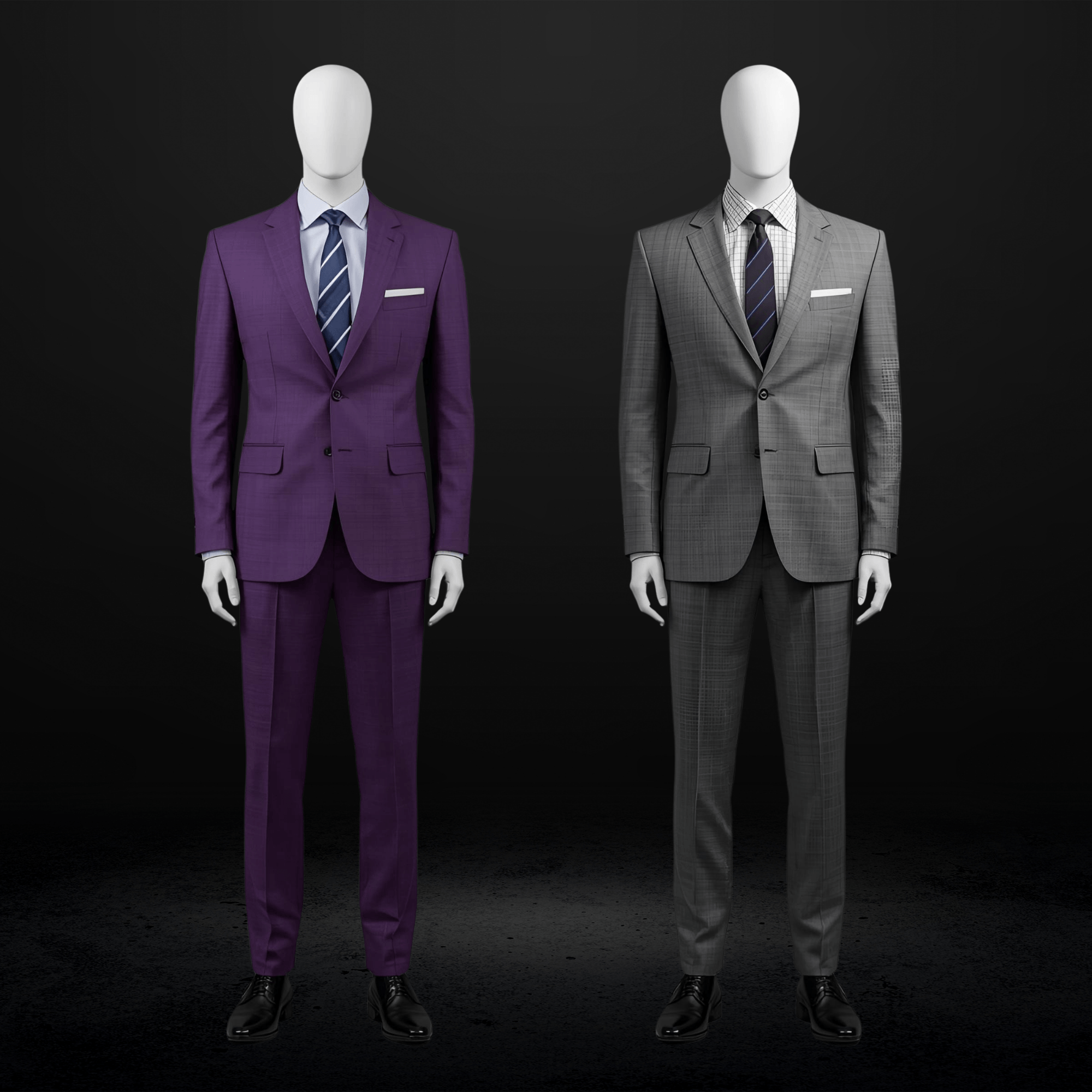
Method 2: Analogous Colors (Soft, Harmonious)
Analogous colors sit next to each other on the color wheel. They create a cohesive, flowing look without jarring contrast.
Examples:
- Blue → Blue-green → Green
- Red → Red-orange → Orange
- Purple → Blue-purple → Blue
Best for: Couples who want to look “together” without being loud. Creates a romantic, soft aesthetic.
Prom example: Her dusty blue dress with his navy suit and steel blue tie. Everything stays in the blue family, creating harmony.
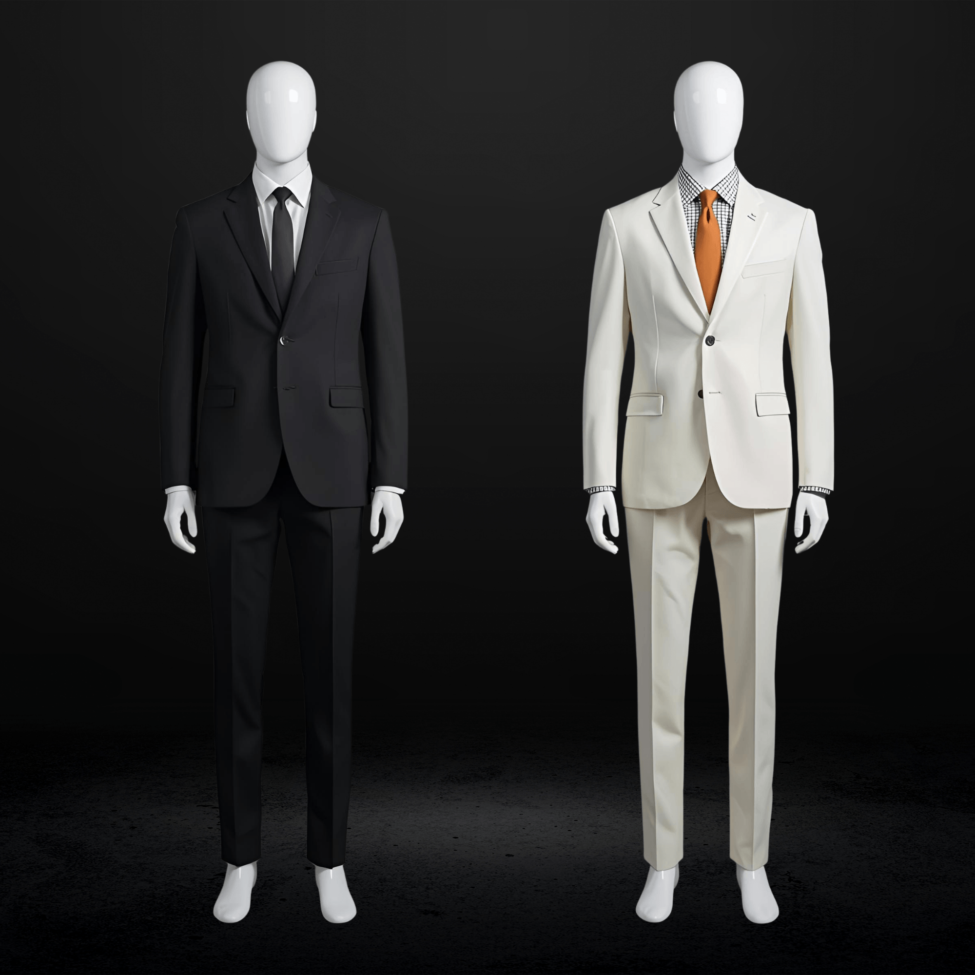
Method 3: Neutral Base + Color Accent (Most Popular 2026)
This is the dominant trend and the safest approach for most couples.
One partner wears a neutral suit (black, charcoal, navy, gray, tan). The accent pieces (tie, pocket square, boutonnière) echo the other partner’s dress color.
Best for: Almost everyone. Most versatile, easiest to execute, hardest to mess up.
Prom example: His charcoal suit with a dusty rose tie and soft pink pocket square to match her dusty rose dress. She stands out. He complements perfectly.
The Dress-to-Suit Color Matching Chart
This is the reference you came for. Find her dress color on the left, then read across for your best suit options and accessories.
| Her Dress Color | Best Suit Colors | Tie/Pocket Square | Avoid |
|---|---|---|---|
| Red / Ruby / Scarlet | Black, charcoal, dark navy | Red, burgundy, black with red accent | Red suit (too matchy); bright blue (clashing temperature) |
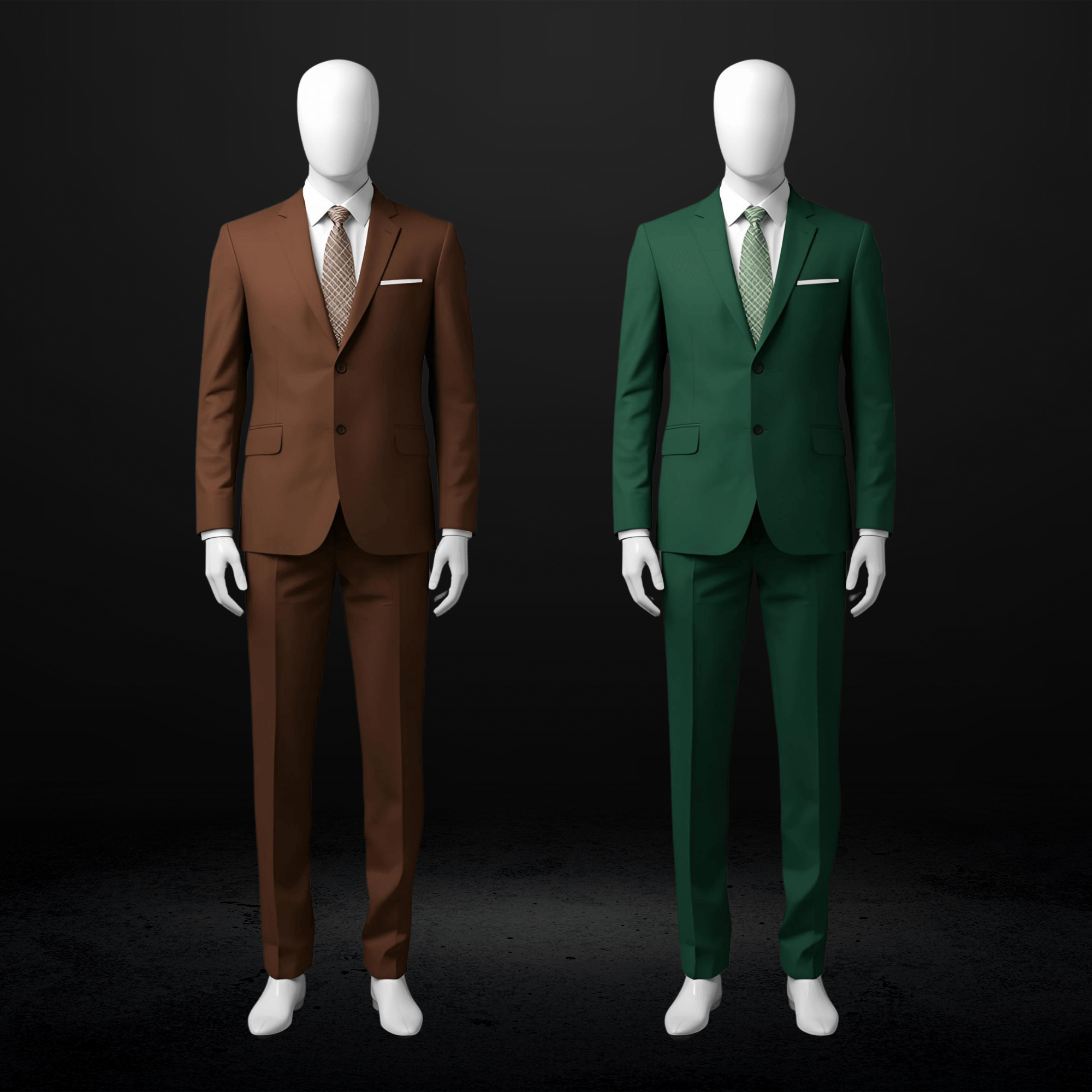
| Burgundy / Wine / Maroon | Charcoal, navy, medium gray | Burgundy, deep plum, navy with burgundy accent | Brown (muddy); olive (clashing) |
| Blush / Light Pink / Rose | Navy, light gray, charcoal, tan | Blush, dusty rose, light pink | Black (too harsh for soft colors) |
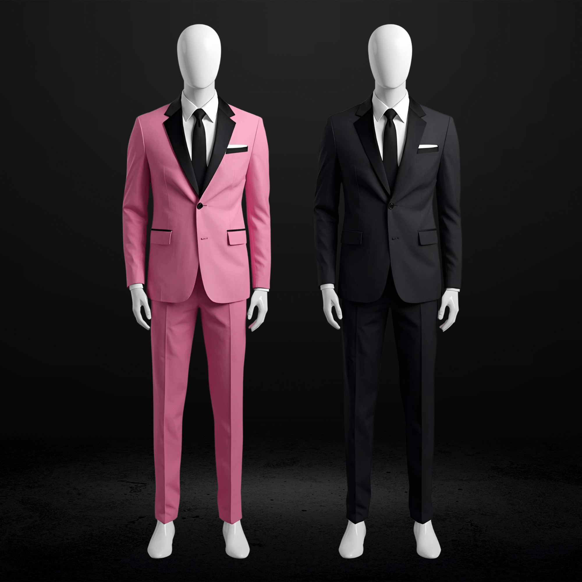
| Dusty Rose / Mauve | Charcoal, navy, medium gray | Dusty rose, mauve, soft burgundy | Bright pink (wrong shade family) |
| Hot Pink / Fuchsia | Black, charcoal, dark navy | Hot pink, magenta, silver with pink | Pink suit (overpowering) |
| Royal Blue / Sapphire | Black, charcoal, medium gray | Royal blue, sapphire, silver | Navy suit (too close, not enough contrast) |
| Dusty Blue / Powder Blue | Navy, charcoal, light gray, tan | Dusty blue, soft navy, silver | Black (too stark for soft palette) |
| Navy / Midnight Blue | Charcoal, light gray, tan | Navy, silver, deep blue | Navy suit (identical, looks “off”) |
| Emerald / Forest Green | Black, charcoal, navy, burgundy | Emerald, forest green, gold | Green suit (too matchy); olive (too similar) |
| Sage / Mint Green | Navy, light gray, tan, cream | Sage, soft green, silver | Dark green (wrong shade family) |
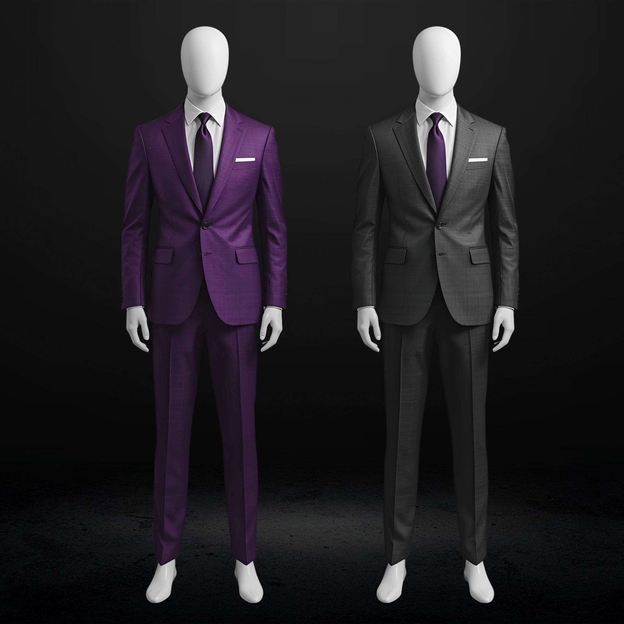
| Purple / Violet | Charcoal, black, navy, light gray | Purple, plum, lavender | Purple suit (overpowering) |
| Lavender / Lilac | Light gray, charcoal, navy, tan | Lavender, soft purple, silver | Black (too harsh for pastels) |
| Gold / Champagne | Black, charcoal, navy, tan | Gold, champagne, ivory | Brown (too close, muddy) |
| Silver / Gray Metallic | Black, charcoal, navy | Silver, gray, black with silver | Light gray suit (blends in) |
| Coral / Peach | Navy, light gray, tan | Coral, peach, soft gold | Orange (too close); bright red (clashing) |
| Yellow / Bright Yellow | Navy, charcoal, light gray | Yellow, gold, navy with yellow accent | Brown (muddy); black (too harsh) |
| White / Ivory / Cream | Navy, charcoal, black, tan | Almost any color works | White suit (matching exactly reads “wedding”) |
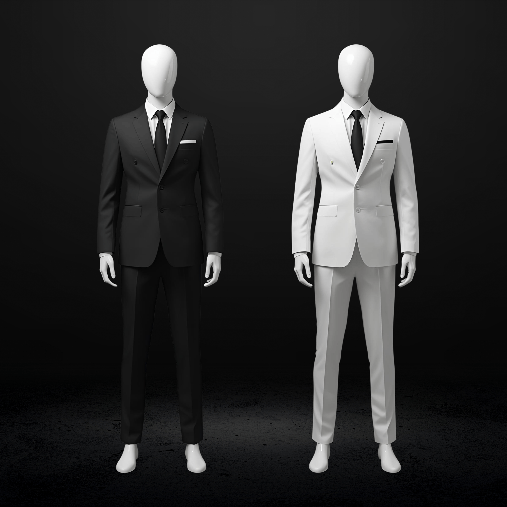
| Black | Black, charcoal, navy | Any bold accent color | None (black dress is most versatile) |
| Multi-color / Patterned | Black, charcoal, navy | Pick ONE dominant color from the pattern | Trying to match multiple colors |
Pro tip: When in doubt, charcoal or navy works with virtually every dress color. These two suits are your safest investment.
How Your Skin Tone Affects Your Suit Choice
Here’s the complexity most guides miss: your suit needs to flatter YOU, not just coordinate with HER. The solution is choosing a neutral suit that works with your complexion, then coordinating through accessories.
Quick Undertone Test
Three simple ways to determine your undertone:
Vein test: Look at the veins on your inner wrist in natural light. Blue or purple veins suggest cool undertones. Green veins suggest warm undertones. Mix of both suggests neutral.
Jewelry test: Does silver or gold jewelry look better on you? Silver = likely cool. Gold = likely warm. Both work equally = neutral.
Sun reaction: Do you burn easily or tan easily? Burns easily often indicates cool undertones. Tans easily often indicates warm undertones.
Pro tip: If you’re unsure about your undertone, have a friend hold a white and an off-white/cream fabric next to your face. Whichever makes your skin look healthier indicates your undertone (white = cool, cream = warm).
Best Suit Colors by Undertone
| Your Undertone | Best Suit Colors | Colors to Approach Carefully |
|---|---|---|
| Cool (pink/blue skin hues) | Charcoal, navy, mid-gray, burgundy, deep plum | Earthy tones (beige, mustard, olive) can wash out complexion |
| Warm (yellow/golden hues) | Tan, brown, olive, warm navy, burgundy, rust | Stark black can be harsh; very cool grays may not complement |
| Neutral | Most colors work; medium gray, navy, charcoal are safest | Overly saturated colors may overpower |
| Deep/dark skin | Rich jewel tones, tan, light gray, cream (high contrast looks stunning) | Very dark colors with no contrast (all-black with black shirt) |
| Light/fair skin | Navy, charcoal, burgundy, forest green (provides flattering contrast) | Pastels and very light colors may wash out |
The Dual Challenge Solution
Prom coordination requires solving two problems simultaneously:
- Your suit must flatter YOUR skin tone
- Your accessories must coordinate with HER dress
The elegant solution: Choose a neutral suit that works with your complexion (navy and charcoal flatter almost everyone). Then coordinate through your tie, pocket square, and boutonnière to her dress color.
This approach means you both look your best individually while still appearing coordinated as a couple.
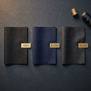
For guidance on finding the exact shade that works for your coloring, custom prom suits in Kansas City can be tailored to your specific undertone rather than settling for whatever’s on the rack.
What Photographs Best: Colors Under Flash and Natural Light
Here’s something no other prom guide tells you: your outfit will be photographed hundreds of times. According to professional photographers on colors that photograph best, muted and toned-down colors almost always photograph better than bright or neon versions. How colors interact under different lighting matters.
Indoor Prom with Flash
Dark suits photograph cleanly. Black, navy, and charcoal provide strong contrast and defined edges under flash.
Bright colors may overexpose. Very saturated colors can blow out under direct flash, losing detail.
Metallic fabrics create hot spots. If her dress has metallic elements, be aware that flash can create glare. Your suit staying matte helps balance this.
Outdoor Pre-Prom Photos (Natural Light)
Lighter suits shine here. Tan, light gray, and softer colors photograph beautifully in natural afternoon light.
Earth tones and jewel tones excel. These color families look rich and dimensional during golden hour.
Pastels work best outdoors. The softer light flatters softer colors that might wash out under harsh indoor lighting.
The Phone Camera Reality
Most prom photos end up on phones and social media. This affects how your coordination reads:
High-contrast combinations read better on small screens. A dark suit with a bright accent (navy suit, coral tie) is instantly visible even in a thumbnail.
Subtle coordination may not register. That carefully matched pocket square in a slightly different shade of blue? It might not be visible in an Instagram post.
Complementary colors (opposites on the wheel) create the most striking social media photos. They pop on screens.
Pro tip: If you’re posting to Instagram or TikTok, remember that phone screens compress color range. Jewel tones (emerald, sapphire, burgundy) maintain their richness on screens better than pastels, which can appear washed out in compressed social media formats.
Tip: If you want your coordination to be visible in photos, go slightly bolder on your accent pieces than you might in person. A tie one shade brighter than her dress photographs more clearly than one that matches exactly.
Same-Sex and Gender-Neutral Couple Coordination
The same color theory principles work for every couple configuration. Here’s how to apply them.
Real example: Jordan and Alex both wanted to wear suits but didn’t want to look like corporate clones. Solution: Jordan chose a deep navy suit with an emerald tie. Alex chose charcoal with a burgundy tie. The complementary jewel-tone accents (emerald and burgundy) created visual connection while each partner wore what flattered their individual coloring. Their prom photos looked intentional without being “matchy.”
Two Suits
Same suit style, different colors: Both partners wear the same fabric and cut in complementary colors. Navy and charcoal. Tan and light gray. Creates cohesion while maintaining individuality.
Same color, different details: Both wear navy, but with different lapel styles (one peaked, one notched), different tie colors, or different pocket squares. Unity with personality.
Contrasting formality: One tuxedo, one suit in coordinating colors. Creates visual hierarchy without “matching.”
Shared accent: Different suits, but matching pocket squares, boutonnières, or cufflinks. One intentional connection point.
Two Dresses
Complementary colors: Colors opposite on the wheel (purple and gold, blue and orange). Bold and statement-making.
Different shades of the same color: One partner in deep emerald, the other in sage. Creates harmony without sameness.
Corsage swap: Each wears a corsage in the other’s dress color. Simple, elegant connection.
Mixed Formal Wear
Jumpsuit and suit, dress and suit (any gender), etc.:
The same coordination principles apply. Neutral base plus shared accent color creates connection without forcing sameness. Focus on one or two elements (tie and corsage, pocket square and jewelry) for intentional coordination.
The key message: there are no rigid rules. The color wheel doesn’t care about gender. Complementary colors complement. Analogous colors harmonize. These principles work for everyone.
2026 Prom Color Trends
What’s actually popular this year and how to work with it.
Trend 1: Jewel Tones for Both Partners
Rich, saturated colors for couples who want to make a statement together: emerald, sapphire, burgundy, amethyst.
How to coordinate: His suit in one jewel tone, her dress in another from the same temperature family (both warm or both cool). Or: she wears the jewel tone dress, he wears a neutral suit with jewel tone accessories.
Trend 2: Metallic Accents Over Fabric Matching
Many 2026 prom gowns feature glitter, shimmer, and metallic elements. The trend is matching metals rather than colors:
- Champagne or gold tie
- Silver cufflinks
- Metallic ribbon on boutonnière
- Watch or jewelry matching her metallic accents
This creates connection without trying to match unmatchable fabrics.
Trend 3: Pastel Pairs
For spring proms and outdoor venues: pale blue, lavender, sage, blush.
Both partners in different pastels from the same temperature creates a soft, romantic, highly photographable look.
Trend 4: Black Dress Freedom
Black remains the most versatile dress color. If she’s wearing black, you have complete freedom with your accent color. This is your chance to express personality through a bold tie or pocket square.
The Three-Step Coordination Formula
Here’s the simplified process:
Step 1: Get the exact color name. Not just “blue” but “dusty blue” or “sapphire” or “midnight blue.” Ask your date for the specific name. Take a photo of the dress if possible.
Step 2: Choose a neutral suit that flatters you. Navy and charcoal work with virtually every dress color and most skin tones. When in doubt, these are your safest options.
Step 3: Match your accessories to her dress. Tie, pocket square, and boutonnière in her dress color or a complementary shade. Done.
That’s the entire process. Three steps.
For a deep dive on fit, fabrics, and how to stand out, see our complete Kansas City prom suit guide. Once you’ve chosen your colors, follow our Kansas City prom suit timeline to make sure everything arrives on time.
Why Custom Suit Fitting Makes Coordination Easier
Here’s something that eliminates the “will this match?” anxiety entirely: Kansas City mobile suit fitting lets you bring actual fabric swatches to compare against a photo of her dress.
Instead of guessing whether that “charcoal” on the website is the right charcoal, you hold the actual fabric next to her dress photo. The guesswork disappears.
Mobile fitting also means:
- The appointment comes to your home (no store trips during school hours)
- Parents can be involved without extra scheduling
- Friends can do group fittings together, coordinating multiple couples at once
- You get expert guidance on which shades work with your coloring
Frequently Asked Questions About Prom Color Coordination
Q: What color suit should I wear to match my date’s dress?
Start with a neutral suit (navy, charcoal, black, gray) that flatters your skin tone. Then coordinate through accessories: tie, pocket square, and boutonnière in your date’s dress color or a complementary shade. The suit stays classic. The accessories create the connection.
Q: Do I have to match my date’s dress exactly?
No. In fact, the 2026 trend is coordinating, not copying. Exact matching is difficult (fabrics and dye lots vary) and can appear overly planned. Coordinated accents create a more polished, modern look than head-to-toe matching.
Q: What color suit goes with a red dress?
Black, charcoal, or dark navy. Add a red or burgundy tie and pocket square to create the connection. Avoid wearing a full red suit unless you’re intentionally going bold and theatrical.
Q: What color suit goes with a blue dress?
Depends on the shade. For royal or sapphire blue: charcoal or black suit with blue accent. For dusty or powder blue: navy or light gray suit with soft blue tie. Avoid wearing a navy suit with a navy dress because they’ll be too similar without enough contrast.
Q: How do I coordinate if my date’s dress is patterned or multi-colored?
Pick ONE dominant color from the pattern for your accent pieces. Let your suit stay neutral (black, charcoal, navy) so it doesn’t compete with the pattern. Trying to match multiple colors from a pattern creates visual chaos.
Q: What if I don’t know my date’s dress color yet?
Choose a versatile neutral suit. Charcoal or navy work with nearly every dress color. Once you know the color, add coordinating accessories. Ties and pocket squares are easy to swap even last-minute.
Q: How do same-sex couples coordinate prom outfits?
The same coordination principles apply. Two suits can coordinate via shared fabric in different colors, contrasting accessories, or different formality levels (one tux, one suit). Two dresses can use complementary colors or different shades of the same hue. Focus on one or two shared elements for cohesion.
Q: What colors photograph best for prom?
Muted, toned-down versions of colors photograph better than neon or very bright shades. Jewel tones and earth tones photograph beautifully in both natural and flash lighting. Avoid extremely bright colors that can reflect onto skin under flash.
Q: Does my skin tone affect which suit color I should wear?
Yes. Cool undertones (pink/blue skin hues) pair well with charcoal, navy, and burgundy. Warm undertones (yellow/golden hues) look great in tan, olive, and warm navy. Neutral undertones can wear most colors. A tailor can help you find the shade that flatters your specific coloring.
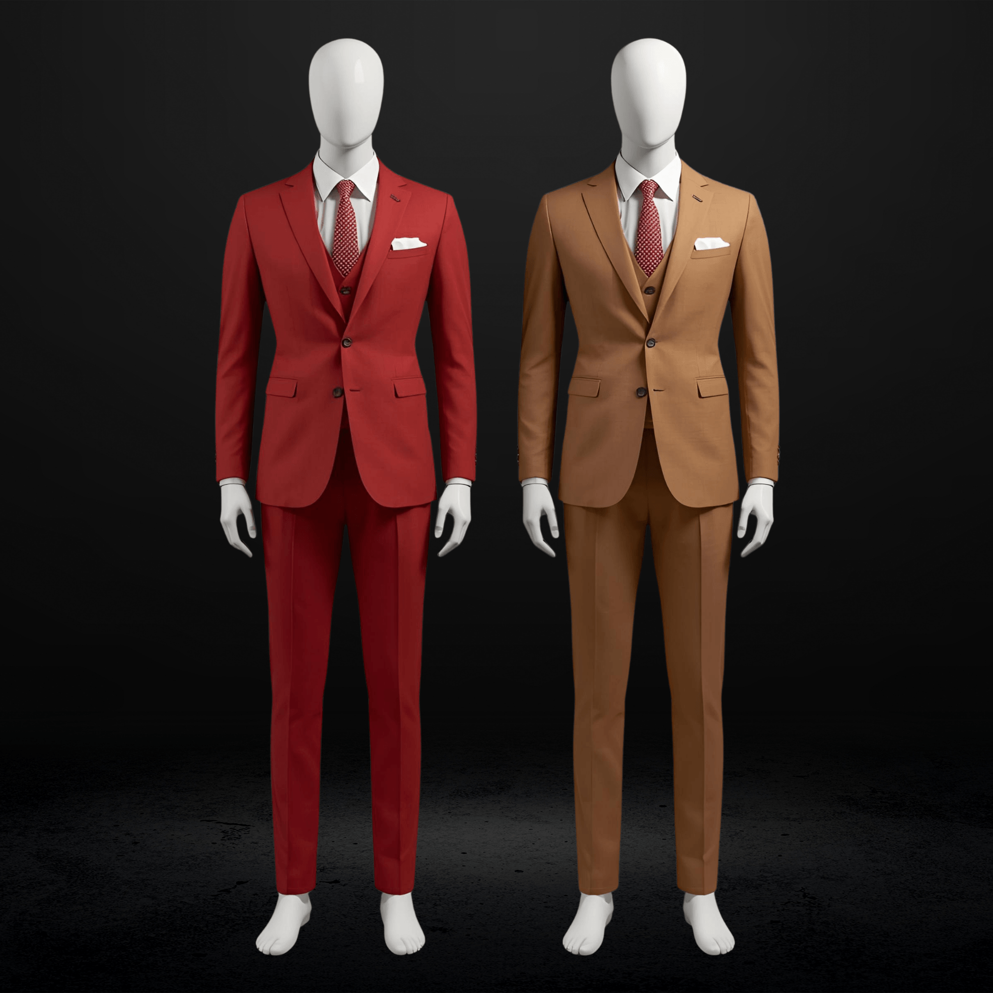
Q: Can I wear a colorful suit to prom instead of a neutral one?
Absolutely. Jewel tones (emerald, sapphire, burgundy) and pastels (lavender, sage, pale blue) are trending for 2026. Just make sure your date’s accessories don’t clash with your suit color. When both outfits are colorful, keep one person’s look bolder and the other more subtle.
Key Takeaways
- Coordinate, Don’t Copy: The 2026 rule. Exact matching is out. Intentional accent coordination is in. Your tie and pocket square connect to her dress; your suit stays neutral.
- The Three-Step Formula: Get her exact color name. Choose a neutral suit that flatters your skin tone. Match your accessories to her dress color.
- Navy and Charcoal Are Universal: When in doubt, these two suit colors work with virtually every dress color and most skin tones.
- Skin Tone Matters: Your suit needs to flatter YOU. Choose the neutral that works with your complexion, then coordinate through accessories.
- Photography Considerations: High-contrast combinations photograph better, especially for social media. Go slightly bolder on accessories than you might in person.
- All Couples, Same Principles: The color wheel doesn’t care about gender. Complementary colors complement. These methods work for every couple configuration.
Ready to Get Your Prom Colors Right?
You now understand exactly how to coordinate your suit with your date’s dress without the guesswork. The next step is finding the right suit in the right shade for your coloring.
The Suit Doctor makes prom coordination simple. Our mobile fitting service brings fabric swatches directly to you, so you can compare options against a photo of her dress and see exactly how colors work together before you commit.
We specialize in:
- Custom and made-to-measure suits fitted to your body and coloring
- Mobile fittings that come to your home on your schedule
- Expert guidance on color coordination and accessory matching
- Group fittings for friend groups coordinating multiple couples
Don’t guess at color matching. Schedule your prom color consultation in Kansas City and walk into prom knowing your coordination is intentional, polished, and photographed-ready.
The Suit Doctor | Custom and Made-to-Measure Suits for Men Who Take Their Look Seriously