 1")
You’ve got the venue locked in. The date is set. Now comes the question every groom eventually faces: what color suit should I actually wear? The answer depends on far more than personal preference. Your venue, season, wedding theme, and even your skin tone all play a role in finding the suit that photographs beautifully and feels right for the occasion. This guide breaks down everything you need to know to make that decision with confidence.
TLDR: Out of all the wedding suit colors and styles, earth tones like tobacco brown, olive, and chocolate are the biggest wedding suit trends for 2026. Navy remains the most universally flattering color. Match your suit to your venue type: lighter tones for outdoor and beach weddings, deeper shades for formal ballrooms. Skip small patterns that cause camera distortion, and choose matte fabrics over shiny materials for better photos.
Why Your Wedding Suit Color Matters More Than You Think
At The Suit Doctor, we’ve helped hundreds of Kansas City grooms navigate this exact decision. The suit you choose does more than complete your outfit. It sets the visual tone for your entire wedding party, appears in every photograph, and signals the formality of your celebration.
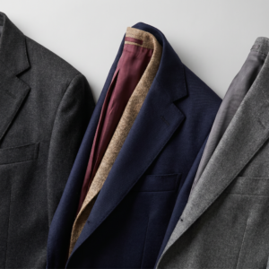
The days of limiting yourself to black or gray are over. In 2026, grooms are embracing individual expression, craftsmanship, and precise tailoring. Whether you’re suiting up for a rustic barn ceremony in Weston or a formal reception at the Kauffman Center, the right color choice makes you look intentional rather than accidental.
Color also has an invisible pull in wedding photography. It quietly sets the mood, defines the feeling of a scene, and connects every image into something that feels complete. Research on how a well-fitted suit affects first impressions shows that people form judgments about confidence, success, and even salary within seconds based on attire alone. Warm golden tones bring a sense of intimacy and nostalgia. Deep blues and greens calm the frame. The most beautiful wedding photos often come directly from thoughtful suit color choices.
Wedding Suit Color Trends for 2026
The wedding suit landscape has shifted dramatically. Here’s what’s trending this year:
Earth Tones Lead the Way
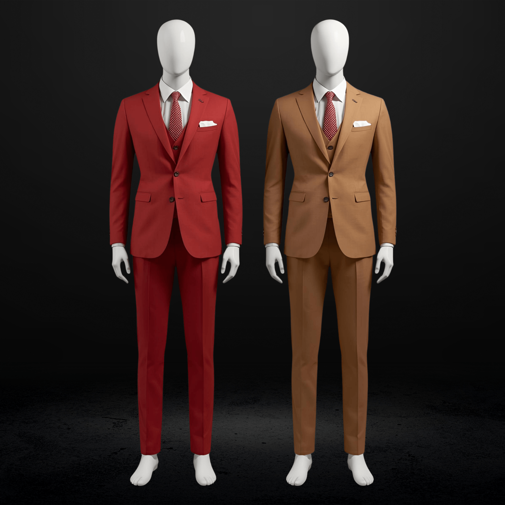
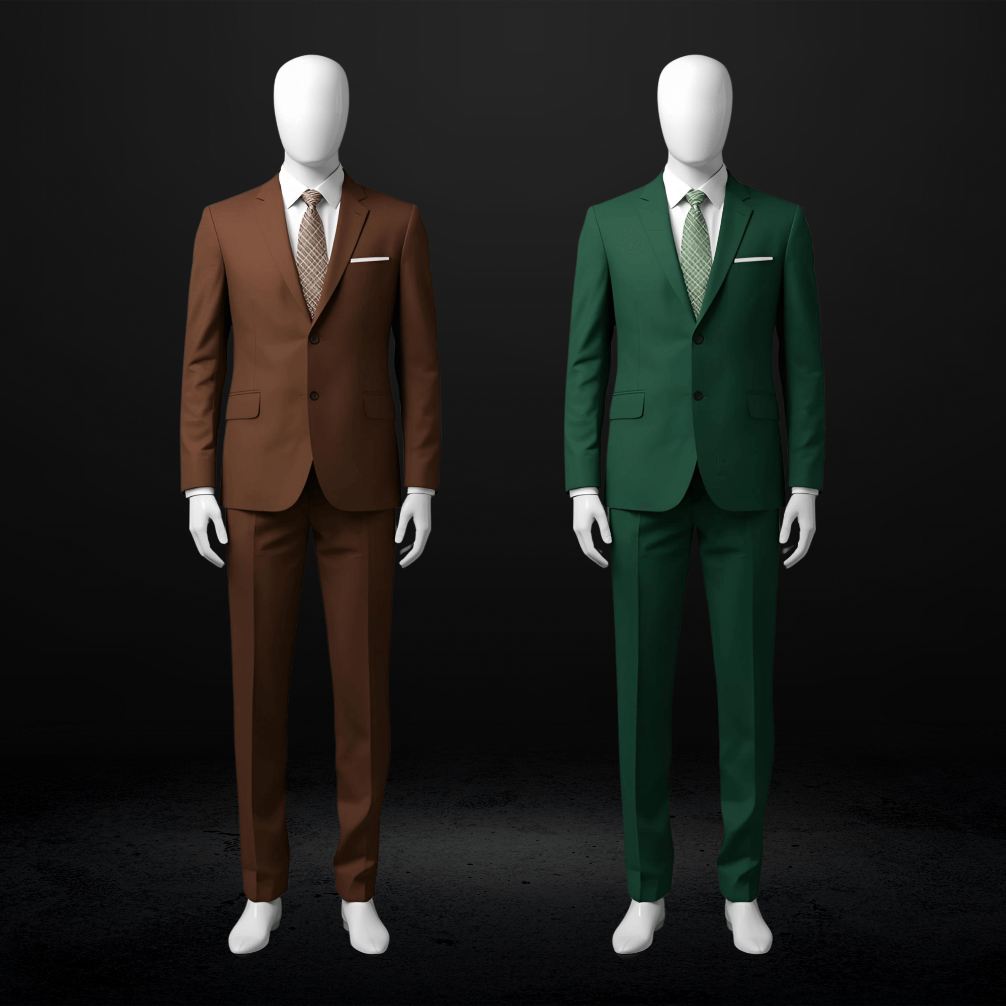
Tobacco brown, chocolate, and camel are THE colors for the 2026 groom’s suit. Clay, warm taupe, dark brown, and olive align perfectly with the earthy, grounded design palettes dominating wedding decor. Sand, beige, and ecru work beautifully for rustic, seaside, and daytime ceremonies.
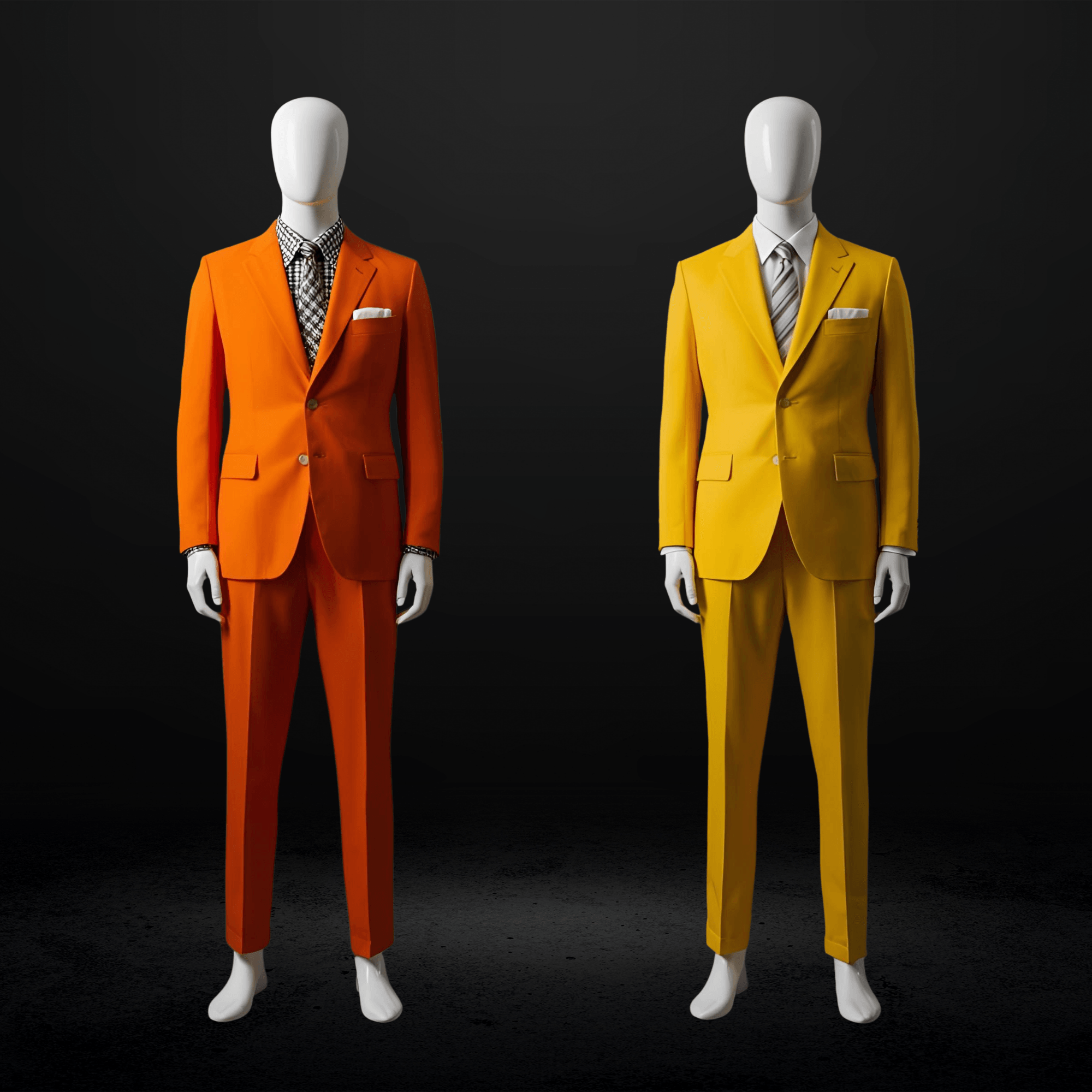
Bold and Expressive Colors
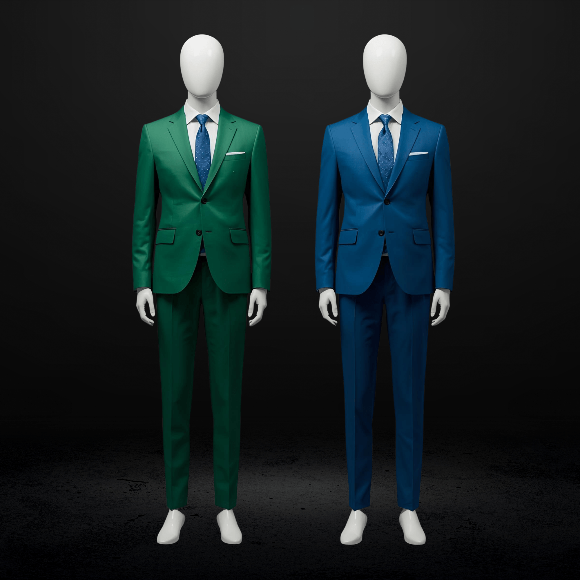
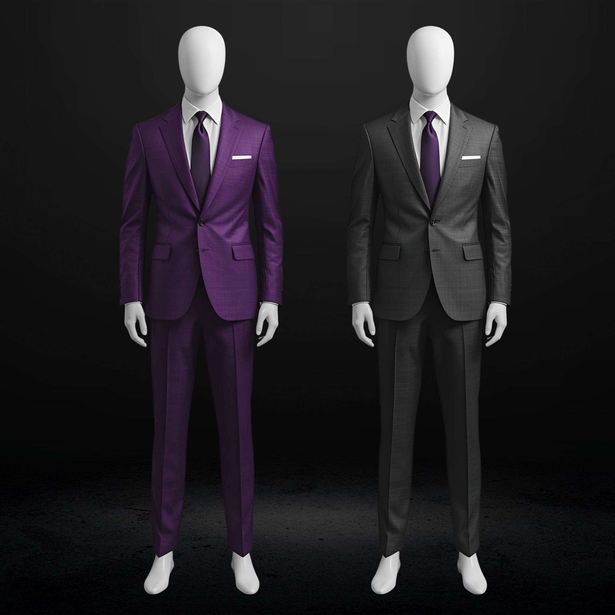
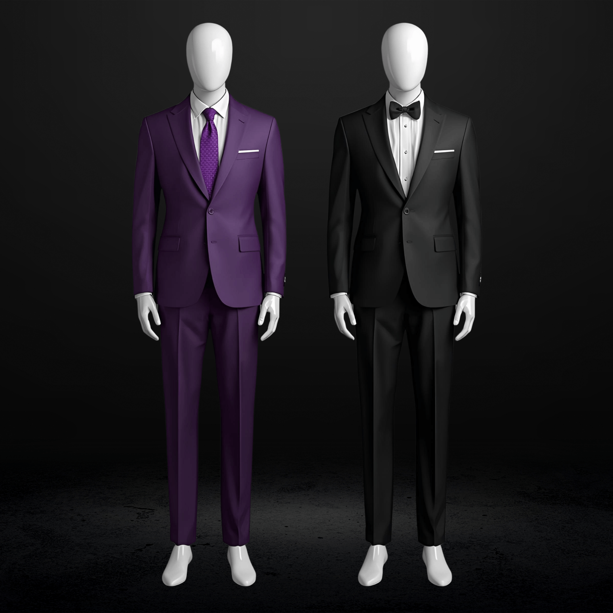
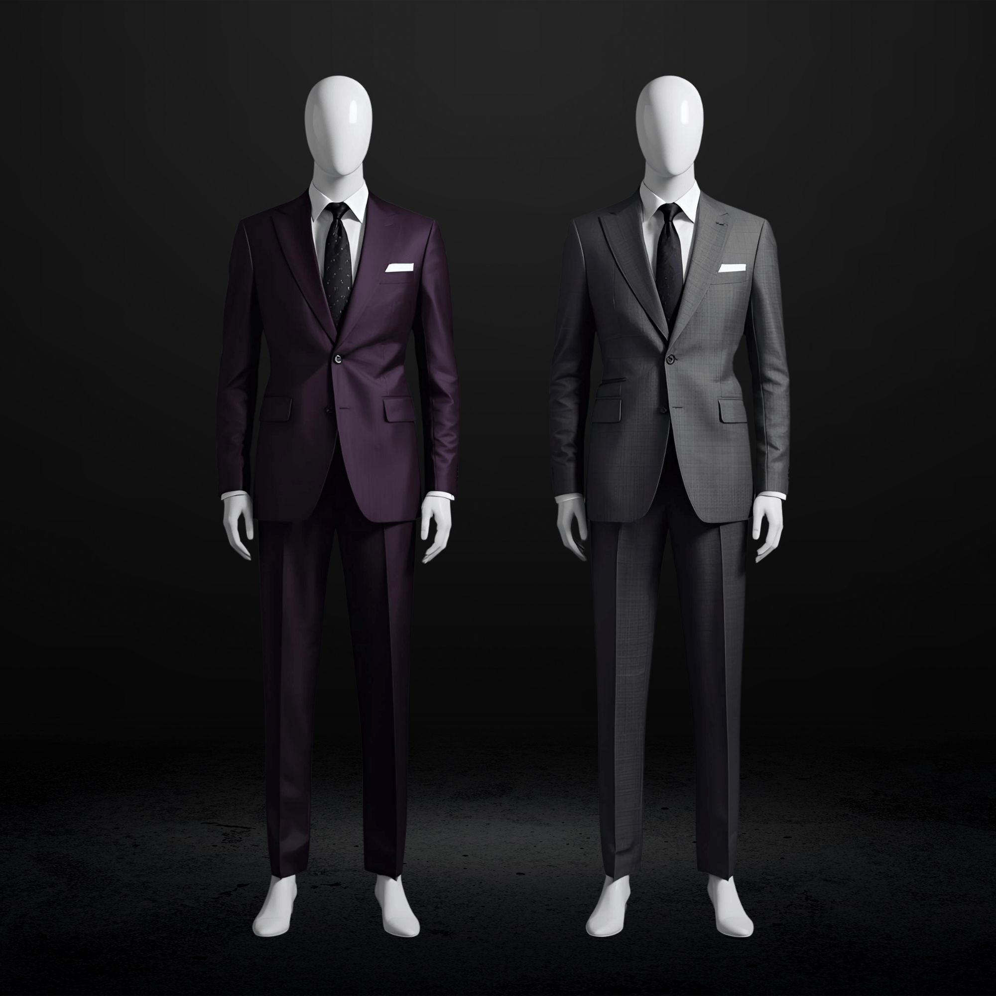
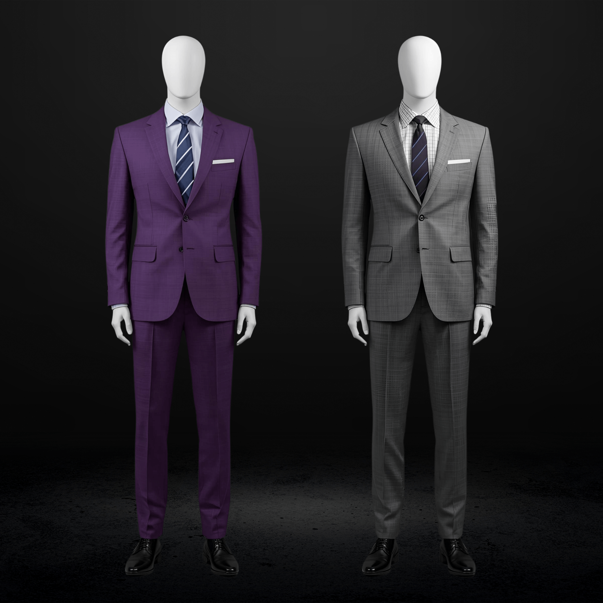
Jewel tones are taking over: emerald green, sapphire blue, and ruby red. Burgundy, aubergine, merlot, and terracotta project warmth and presence. For moody, nighttime celebrations, burgundy, black cherry, and deep purples bring sophisticated elegance.
Nature-Inspired Palettes
Sage green, sky blue, and dusty rose offer freshness with refinement for spring and summer. Olive, forest green, and deep green deliver a luxury feel that photographs gorgeously against natural backdrops.
Classic Colors Revisited
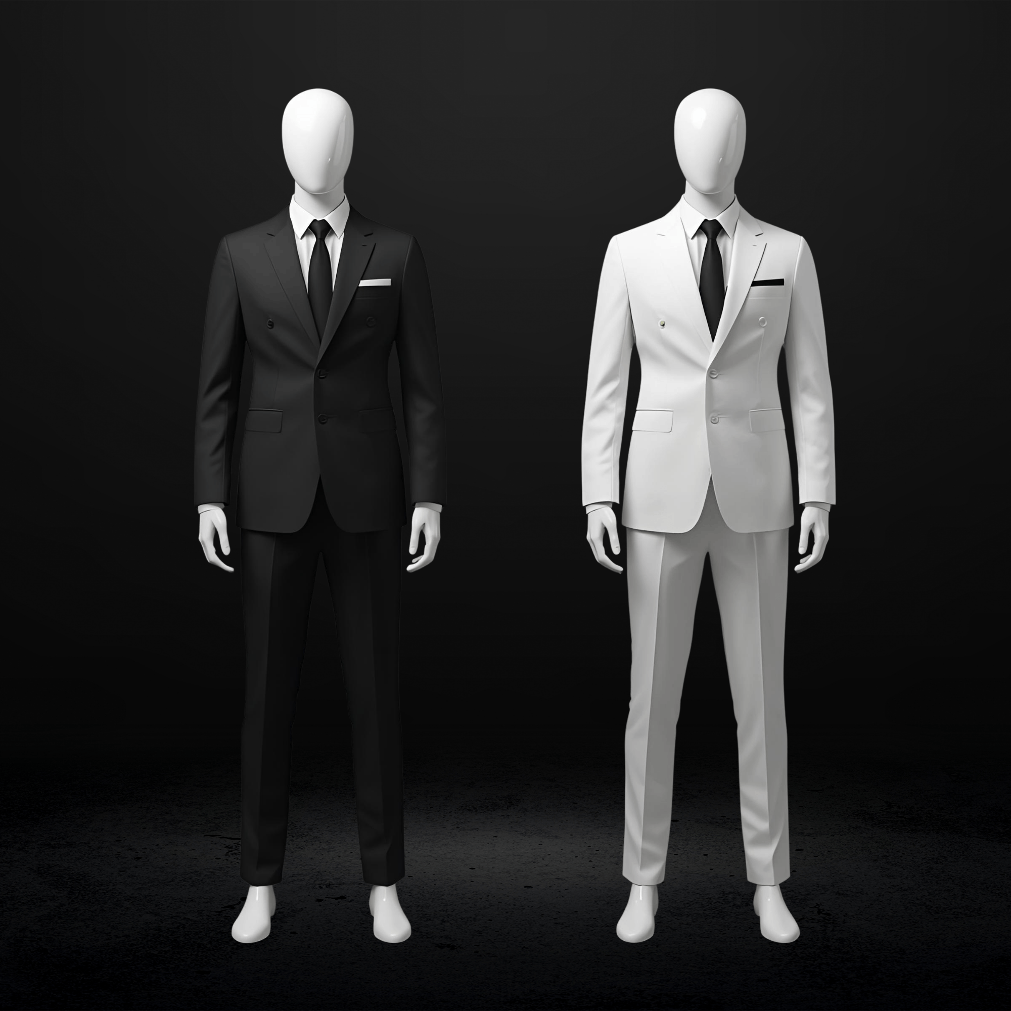
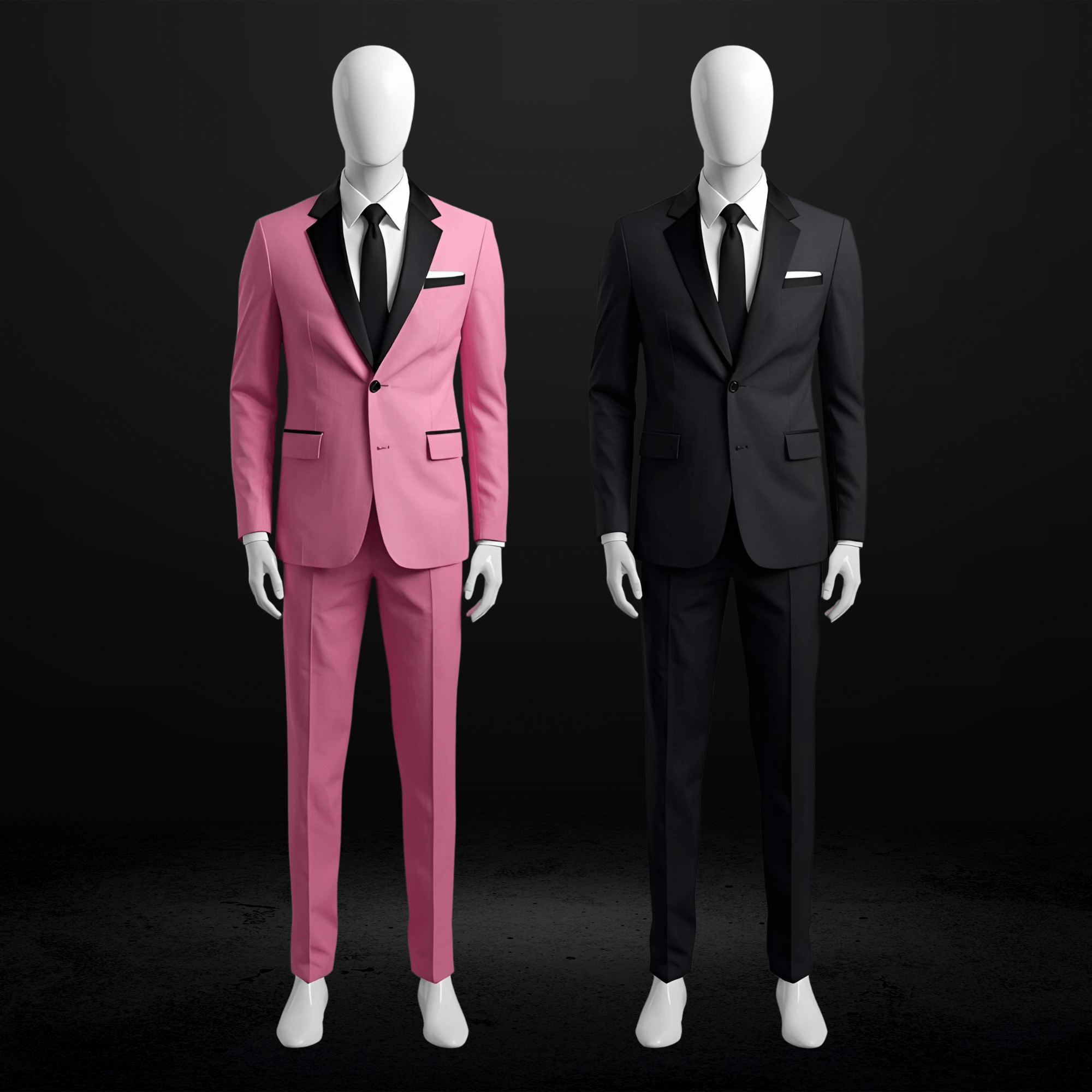
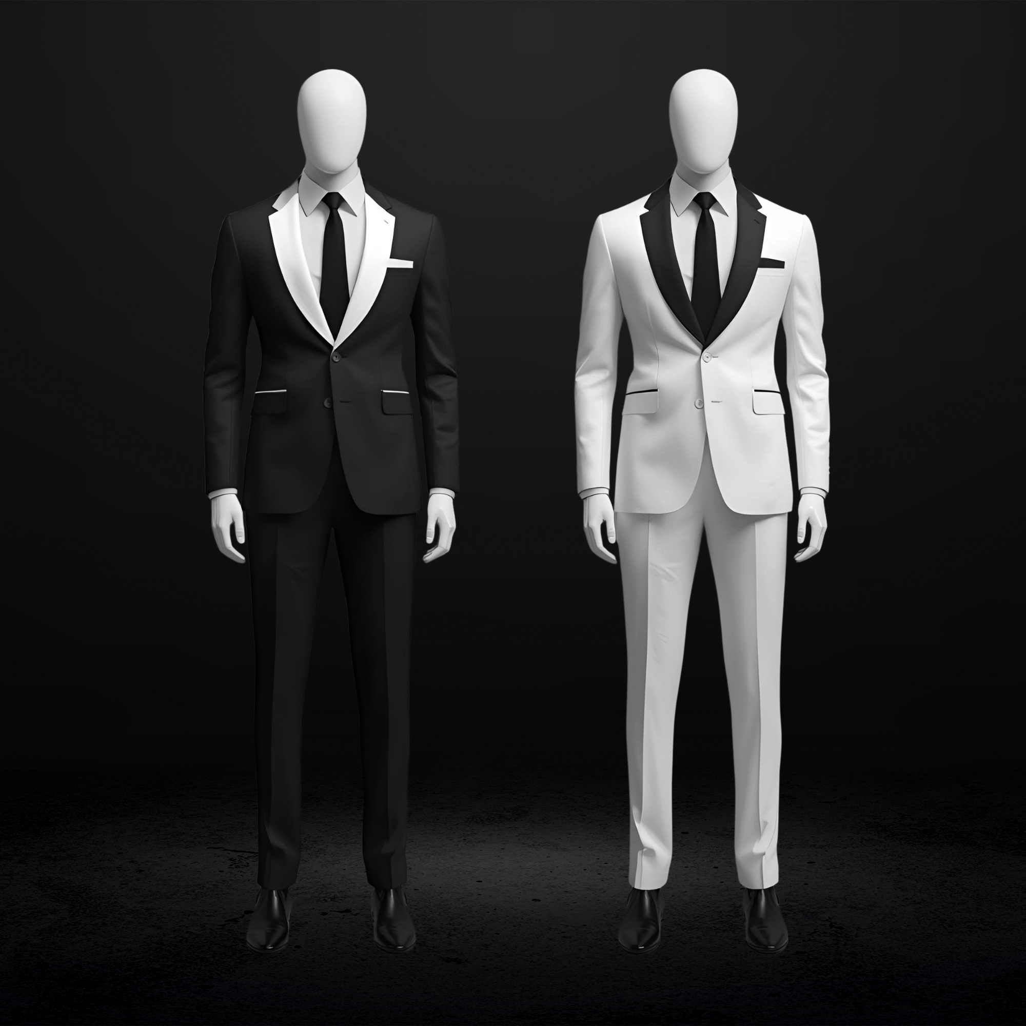
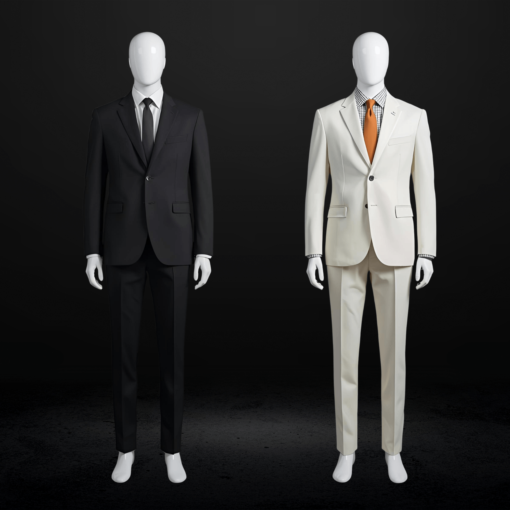
Night blue, petrol blue, and ink blue remain strong for elegant evening looks. Anthracite grey and medium grey work perfectly for urban or very formal ceremonies. Black is back for dressed-up weddings, especially in three-piece versions.
Pantone’s Color of the Year: Cloud Dancer
Pantone 11-4201 Cloud Dancer is described as “a billowy white imbued with serenity” that “serves as a symbol of calming influence in a society rediscovering the value of quiet reflection.” This soft white pairs beautifully with pastels, metallics, earthy tones, and vibrant pops. Couples are incorporating Cloud Dancer into florals, decor, stationery, and wedding party attire.
Pro tip: Silver is replacing gold as the dominant metallic accent for 2026. Keep this in mind when selecting cufflinks, tie bars, and other accessories.
The Mismatched Trend
One of the biggest shifts: coordinated but NOT matching wedding parties. Groomsmen can wear coordinating suits in olive, charcoal, or muted jewel tones, creating elegant cohesion without uniformity. This approach lets each groomsman wear something that flatters his body type while maintaining visual harmony.
How to Choose Wedding Suit Colors by Season
Your wedding date significantly influences which colors will look and feel best.
Spring Weddings: Light, Fresh, and Playful
| Best Colors | Why They Work |
|---|---|
| Light grey | Timeless, versatile, reflects light beautifully |
| Powder blue | Evokes calm, perfectly aligned with spring palette |
| Pastel shades | Mint, blush, lavender add unique elegance |
| Tan/khaki | Ideal for casual daytime ceremonies |
| Navy | Adapts well with lighter accessories |
Best Fabrics: Lightweight wool, cotton blends, wool-silk blends. Spring weather can be unpredictable, so breathable fabrics that transition from cool mornings to warm afternoons work best.
Formality Guide: Daytime events favor lighter tones. Evening calls for deeper shades. Garden venues favor lighter greys, blues, or pastels.
Tip: Pair spring suits with floral ties or patterned socks for a playful touch that complements the season.
Summer Weddings: Cool, Bright, and Breezy
| Best Colors | Why They Work |
|---|---|
| Beige/tan | Classic for outdoor, works against sunny backdrops |
| Pale blue/sky blue | Cool, refreshing, crisp |
| Light grey | Avoids absorbing heat |
| Ivory/cream | Perfect for beach weddings |
| Stone grey | Pairs beautifully with pastels |
Best Fabrics: Linen, linen blends, lightweight tropical wool, cotton, seersucker. Light colors reflect heat rather than absorb it.
Key Caution: Avoid dark colors like black or charcoal for outdoor summer weddings. They absorb heat and can feel heavy in photographs against bright, sunny backdrops.
Fall Weddings: Rich and Warm
| Best Colors | Why They Work |
|---|---|
| Burgundy | Deceptively versatile, makes a bold statement |
| Emerald/deep green | Luxury feel, harmonizes with fall foliage |
| Navy | Pops against autumn backdrops |
| Warm browns, rust, terracotta | Align with earthy fall palettes |
| Forest green, deep olive | Natural sophistication |
Best Fabrics: Heavier wool, tweed, velvet. Warmer fabrics add depth and sophistication that match the season.
Pattern Opportunity: Tone-on-tone patterns like paisley or jacquard photograph well in fall light. Subtle windowpane or glen plaid adds personality without overwhelming.
Winter Weddings: Deep and Dramatic
| Best Colors | Why They Work |
|---|---|
| Deep navy/midnight blue | Sophisticated evening elegance |
| Charcoal | Classic winter formality |
| Black | Quintessential formal choice, especially three-piece |
| Dark burgundy | Rich alternative to black |
| Deep green | Seasonal without being obvious |
Best Fabrics: Heavier wool, cashmere blends, velvet. Three-piece suits are practical for warmth and formality.
Wedding Suit Colors by Venue Type
Where you’re getting married matters as much as when. Here’s how to match your suit to your setting.
Beach and Destination Weddings
Best Colors: Tan, khaki, light grey, light blue, pale grey, soft pastels, sand, sky blue, sage green
Best Fabrics: Linen or linen-cotton blends are essential. These shades reflect sunlight, keep you cooler, and complement natural coastal backdrops.
Key Tips:
- Solid-colored linen suits are clear winners
- Avoid bold prints or checks that feel out of place against soft coastal tones
- Loafers work better than dress shoes on sand
Pro tip: Neutral colors like tan or light gray work seamlessly against ocean backdrops, while bolder tones like sky blue or terracotta make a statement without clashing.
Garden and Outdoor Weddings
Best Colors: Sage green, light blue, stone, medium grey, earth tones
Best Fabrics: Mid-weight cotton or tropical wool
Key Tips:
- Choose colors that don’t disappear against greenery
- Lighter greys, blues, or pastels feel fresh
- Earth tones harmonize with natural surroundings
Barn and Rustic Weddings
Best Colors: Medium to dark brown, navy for contrast, olive/dark green, burgundy
Key Tips:
- Brown and earth tones harmonize with exposed wood beams
- Navy creates striking contrast against warm-toned rustic backgrounds
- Olive and dark green blend naturally with rural surroundings
- For vineyard settings, earthy jewel tones like olive, burgundy, or navy complement lush landscapes and photograph beautifully at sunset
Formal Ballroom and Hotel Weddings
Best Colors: Navy, charcoal grey, black, deep burgundy
Key Tips:
- Darker, more traditional colors are expected in formal settings
- Peak or shawl lapels in black or navy for classic elegance
- Three-piece suits recommended for added formality
Urban and Rooftop Weddings
Best Colors: Charcoal, medium grey, modern navy, steel blue
Key Tips:
- Modern cuts and slimmer fits complement urban architecture
- Stone and steel blue pair well with city skylines
- Consider how evening city lights will interact with your suit color
Church and Traditional Weddings
Best Colors: Dark navy, charcoal, black
Key Tips:
- Three-piece suits are particularly appropriate
- Conservative styling shows respect for the setting
- A waistcoat signals traditional distinction
Kansas City Venue and Suit Pairing Guide
Garden parties and rustic venues rank as the most popular wedding settings, with the majority of weddings now taking place in outdoor locations according to wedding industry data. Here’s how to match your suit to popular Kansas City venues:
Formal Indoor Venues
The Grand Hall at Power and Light: Classical architecture and chandeliers call for navy, charcoal, or black three-piece suits.
Kauffman Center: Modern glass and city views pair beautifully with sleek navy or charcoal.
The Glasshouse at River Oaks: European-inspired conservatory works with navy, charcoal, or sophisticated earth tones.
Garden and Outdoor Venues
Powell Gardens: 970 acres of botanical gardens, meadows, and lakes. Sage, light blue, stone, and earth tones photograph beautifully here.
Overland Park Arboretum: 300 acres of manicured gardens call for light grey, sage, or medium blue.
The Legacy at Green Hills: Rolling hills and panoramic views pair with tan, sage, or light grey.
The Guild: Crossroads Arts District urban garden with string lights. Navy, stone, or forest green work well.
Rustic Venues
Eventful at Locust Grove (Weston): Beautiful outdoor settings call for brown, burgundy, or olive.
The Barn at Schwinn Produce Farm: Natural rustic beauty pairs with earth tones, navy, or olive.
Lone Summit Ranch: Ranch setting works with olive, brown, or navy.
Urban Venues
Boulevard Brewing Company: Stunning skyline views pair with stone, navy, or modern charcoal.
The Simpson House: Midtown garden with fountain and lush grounds. Navy, light grey, or sage.
Kansas City Seasonal Considerations
- April: Windier, temperatures in the 50s-70s. Medium-weight fabrics work best.
- May-June: Warmer, less wind. Lighter fabrics and colors photograph well.
- July-August: Hot and humid. Lightweight fabrics essential, lighter colors recommended.
- September-October: Cooler, fall colors emerge. Transition to richer tones and medium-weight wool.
- Winter: Sun sets early (5:00-6:30pm), affecting photo lighting. Heavier wool and darker tones work best.
If you’re planning a Kansas City wedding and want expert guidance on color and style, the Kansas City wedding suit specialists at The Suit Doctor can walk you through options that match your specific venue.
What Wedding Suit Colors Photograph Best
Your wedding photos last forever. Choosing colors and fabrics that photograph well matters more than most grooms realize.
Best Performers Under Any Lighting
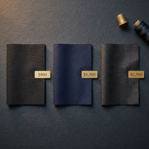
Navy and medium-to-dark grey photograph excellently across most lighting conditions. Matte fabrics outperform shiny materials under flash. Wool and wool blends absorb light evenly, creating clean, sharp images. Earth tones bring warmth, especially in natural light.
Lighting Conditions and Color Behavior
Morning and afternoon ceremonies: Lighter, softer colors photograph beautifully in natural light.
Evening weddings: Richer, deeper tones create sophisticated appearance under artificial lighting.
Golden hour: Warm tones like tan and earth colors photograph gorgeously. Grey linen suits complement golden-hour lighting beautifully.
Indoor flash: Matte finishes are critical. Shiny fabrics create glare.
Very light colors: Can appear washed out in bright outdoor settings.
Very dark colors: May lose detail in evening photography.
Critical Pattern Warning for Photos
Avoid small patterns that cause moiré effect. Herringbone, tight pinstripes, and small checks interfere with camera sensors, creating unwanted visual distortions in photos. Understanding why certain suit patterns photograph poorly can save you from ruined wedding images. Larger, more spaced-out patterns are safe for cameras. Discreet patterns like fine checks, micro-stripes, or woven textures are trending for 2026 because they add visual interest without creating photography problems.
Pro tip: Natural fibers like wool, cashmere, and linen photograph better than synthetics. Polyester blends can catch light awkwardly, creating unnatural sheen that’s unflattering in photos.
How to Choose a Wedding Suit Color for Your Skin Tone
The right suit color enhances your natural complexion. The wrong one can make you look washed out or sallow.
Understanding Your Undertone
Skin tone isn’t just about being light or dark. It’s about undertone:
Cool undertone: Skin has pink, red, or bluish hues. Veins appear blue or purple. Silver jewelry looks better on you.
Warm undertone: Skin leans yellow, peach, or golden. Veins appear greenish. Gold jewelry looks best.
Neutral undertone: Balance of both. You can wear silver and gold equally well.
Best Suit Colors by Undertone
| Undertone | Best Colors | Avoid |
|---|---|---|
| Cool | Charcoal grey, navy blue, mid-grey, slate, burgundy, deep plum | Earthy tones like beige, mustard, olive |
| Warm | Tan, camel, olive green, brown/chocolate, rust, warm blue | Cool greys, stark black |
| Neutral | Medium grey, classic blue, soft charcoal, dusty brown | Very few limitations |
The Most Universally Flattering Color
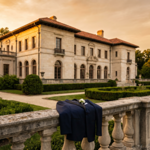
Navy. Navy works for nearly every man because it creates contrast without harshness. It enhances clarity in the complexion while reading professional and timeless. Navy flatters cool, warm, and neutral undertones alike. As noted in this groom wedding suit style guide, navy and charcoal consistently outperform black for most wedding settings.
Pro tip: Not sure about your undertone? Look at the veins on your inner wrist in natural light. Blue or purple veins suggest cool undertones. Green veins suggest warm. If you see both, you’re likely neutral.
Contrast Consideration
Beyond undertone, consider how strongly your hair, eyes, and skin differ:
High contrast (dark hair + light skin): Can wear deeper navies, charcoal, and bolder patterns elegantly.
Low contrast (lighter hair + lighter eyes): Looks best in mid-gray, softer navies, and gentle patterns.
Tuxedo vs Suit: When to Wear Each
Understanding when a tuxedo is appropriate versus when a suit works better prevents overdressing or underdressing.
| Feature | Tuxedo | Suit |
|---|---|---|
| Lapels | Satin-covered (peak or shawl) | Same fabric as jacket |
| Pants | Satin stripe, no belt loops | Plain, usually with belt loops |
| Shirt | Formal shirt with studs | Dress shirt with buttons |
| Shoes | Patent leather or opera pumps | Oxfords, brogues, loafers |
| Tie | Bow tie | Necktie or open collar |
| Best Time | Evening (after 6 PM) | Any time |
The Formality Rule
White-tie or Black-tie: Tuxedo required.
Black-tie optional: Tuxedo permitted but not required. A formally-styled suit works.
Cocktail attire and below: Suits only. Tuxedos should NOT be worn.
Key rule: It’s a bad look to overdress. You don’t want to be better dressed than the groom if you’re a guest, or appear out of sync with your venue’s formality.
Tuxedos are traditionally reserved for weddings that begin after 6 PM. The satin elements catch light beautifully in evening settings, which is why they’ve remained the standard for formal celebrations.
If you’re still deciding between a tuxedo and suit, our guide on choosing between groom suits and tuxedos in Kansas City breaks down the decision in detail.
Three-Piece vs Two-Piece Suits for Weddings
The waistcoat question deserves careful consideration.
When to Choose a Three-Piece
The vest adds structure, formality, and visual balance. It also allows the groom to remove his jacket while remaining properly dressed during dancing or the reception.
Best for:
- Formal and traditional weddings
- Church, registry office, or historic venue ceremonies
- Autumn and winter weddings (extra warmth layer)
- When photographs are a priority and structure matters
Key Benefits:
- Creates smoother transition between shirt and jacket
- Establishes clean vertical line that elongates the torso
- Provides structure when jacket is removed
- Gives a slimming effect and better posture
Popular Strategy: Groom in three-piece while groomsmen wear two-piece suits. This naturally differentiates the groom without requiring completely different colors.
Cost Factor: Three-piece suits typically cost 15-25% more than two-piece due to additional material and tailoring.
Style Rule: Bottom button of vest always left undone. Leave jacket unbuttoned when wearing vest.
When Two-Piece Works Better
- Casual or semi-formal weddings
- Summer weddings (less layering, more breathable)
- Beach or outdoor venues where lightness matters
- Budget is a key factor
- When you want more freedom of movement
Lapel Types: Which to Choose for Your Wedding
Lapel choice affects both formality and how your body is framed in photographs.
Notch Lapels: The Versatile Standard
The most common style with a visible V-shaped gap where collar meets lapel. Understated and slightly more relaxed than other options.
Best for: Everyday wear, semi-formal occasions, modern casual weddings, destination and outdoor weddings.
Effect: Slims down the chest and shoulders.
Peak Lapels: The Formal Statement
The bottom edge points upward with the peak sitting higher on the shoulder. Bold and more of a style statement.
Best for: Weddings (especially as groom), formal events, black-tie, double-breasted suits, galas.
Effect: Broadens the shoulders. Projects power, structure, and confidence.
Shawl Lapels: The Ultra-Formal
Smooth continuous curve with no break in the lapel. Only normally seen on dinner jackets and tuxedos.
Best for: Black-tie events, formal dinners, ultra-formal occasions.
Effect: Creates a fluid, polished, streamlined silhouette. Often crafted from satin, grosgrain, or velvet.
Quick Wedding Lapel Guide
- Classic weddings: Peak or shawl lapel in black or navy
- Modern weddings: Notch lapel in light gray or tan
- Destination or outdoor weddings: Lightweight notch lapel suits in sand or blue tones
- Groom differentiation: Peak lapel for groom, notch lapel for groomsmen
How the Groom Should Stand Out from Groomsmen
When bridesmaids are mismatched, the bride still draws the eye because she’s the only one in a wedding dress. For the groom, standing out requires intentional choices.
Proven Strategies
Different suit color or shade: Groom in a deeper tone, groomsmen lighter (or vice versa). Matching but not identical.
Three-piece for groom only: The vest adds visual distinction.
Different lapel style: Peak lapel for groom, notch for groomsmen.
Fabric upgrade: Velvet jacket for groom, wool for groomsmen.
Different or larger boutonniere: The groom’s boutonniere should be unique and more elaborate.
Statement pocket square: A unique color or fold.
Tie or bow tie difference: Different style or color than groomsmen.
Contrast jacket: Midnight blue groom versus black groomsmen.
Different shoe style or color.
The Mismatched Groomsmen Trend: Rules for Success
Coordinated but not matching wedding parties are exploding in popularity. Here’s how to pull it off.
The Essential Rules
Embrace a curated color palette: Subtle tones matter. Stick to chosen colors throughout attire and accessories for cohesive results.
Maintain the same level of formality: One guy in a tux while another wears suspenders without a jacket looks like people misunderstood the assignment.
Suit color and fabrics should match: Mixing should be subtle. If the theme is navy or grey, let guys who own similar options wear them as long as fabric and color generally align.
Set clear guidelines: Decide how much freedom each groomsman has. Make clear what options will and won’t be allowed.
Provide early shopping time: Mismatched looks require earlier planning than traditional matching rentals.
Popular Mismatched Approaches
- Same color family, different shades (sand, stone, mocha palette)
- Same pants, different jackets
- Same suit, different tie or accessory colors
- Each groomsman picks flattering jacket style (single vs double-breasted) in same fabric
- Matching bow ties to create a unifying element with uniform pant colors
- Suit separates: blazers with chinos
Coordinating with the Bride’s Dress
Your suit should complement the bride without competing with her.
By Dress Color
White gown: Almost any suit color works. Most options are on the table.
Ivory or champagne: Navy, charcoal, and black all work well. Avoid pure white shirts with ivory dress, which can look jarring. Opt for off-white or ivory shirt instead.
Colored or non-traditional: Choose a suit that complements rather than competes. The goal is coordination, not matching.
Matching Through Accessories
- Tie color that picks up the bride’s bouquet color or accent color
- Pocket square that coordinates with overall wedding palette
- Boutonniere that matches wedding florals
The groom’s accessories don’t need to match the bride’s exactly, but many couples choose accessories that complement each other.
Wedding Suit Accessory Coordination Guide
Ties and Bow Ties
- Ties matching bridesmaid dress color is the easiest coordination method
- Match tie fabric to bridesmaid dress fabric (satin with satin)
- Opt for a tonal look: same color family, varying shades
- Choose tie width that matches lapel width for proportion
- Groom: different tie style or color for differentiation from groomsmen
Pocket Squares
- Should coordinate with tie but NOT match exactly
- If boutonniere is present, you may not need pocket square
- Coordinate colors: choose harmonious or complementary hues
- If boutonniere is elaborate, opt for simpler pocket square fold
Boutonniere
- The groom’s boutonniere should complement the bride’s bouquet but can be more unique and personalized
- Consider different boutonnieres for each groomsman in mismatched looks
Shoes
- Lighter shoe colors (tan, medium brown) for spring and summer
- Black shoes for formal and evening events
- Suede is more seasonal and casual than high-polish leather
- Loafers are versatile for various formality levels
- Beach weddings: polished loafers, dress shoes with sturdy soles, or boat shoes
Cufflinks, Watches, Belts
- For black-tie: cufflinks are non-negotiable
- Skip the belt with double-breasted suits. Use suspenders instead
- Watch should complement metal accents (silver or gold based on your undertone)
Patterned Suits for Weddings
Patterns add personality, but require careful selection.
Windowpane
Sophisticated and subtle. Wedding appropriate. A windowpane pattern remains assertive because the boxes are large. Keep it as the focus by pairing with solid shirts and ties. Subtle windowpane in a slightly lighter shade offers design only noticed by those paying attention.
Glen Plaid
Elegant and professional. Appropriate for formal and semi-formal events. Works well with subtle accessories like textured ties or pocket squares. Stick to muted color palettes for a polished look.
Checks
More casual and a good entry point for patterned suits. Handles bolder colors and playful combinations. Better for casual and semi-formal weddings.
Key Pattern Rules
- Bold pattern suit equals simple everything else (solid shirt, minimal accessories)
- Pick one secondary color from the pattern for tie and pocket square
- Critical for photos: Avoid tight herringbone and small patterns. They cause moiré effect in photographs
- Larger, more spaced-out patterns are safe for cameras
- Discreet patterns (fine checks, micro-stripes, woven texture) are trending for 2026
Double-Breasted Suits: The 2026 Revival
One of the standout styles making a comeback: the double-breasted suit offers vintage charm with contemporary style.
Styling Tips
- Let the double-breasted style be the statement. Opt for a solid-colored shirt and tie
- Consider peak lapels: they create a more formal silhouette that complements double-breasted jackets
- Skip the belt. Belts disrupt the clean lines. Use suspenders instead
- A double-breasted suit in clay or dark brown aligns beautifully with 2026’s earth-toned, textured palettes
Best For: Formal weddings, grooms wanting to stand out, fall and winter ceremonies, vintage-inspired themes.
Real-World Scenarios: Putting It All Together
Scenario 1: Non-Traditional Outdoor KC Wedding
A couple planning an October garden ceremony at Powell Gardens. She’s wearing a champagne dress with sage and dusty rose bridesmaid colors. He initially assumed he needed a black suit. After learning about venue-color coordination, he chooses an olive suit with a cream pocket square that picks up the champagne tones. Groomsmen wear complementary sage-toned suits. The photos capture warm fall light beautifully against the earth-toned suiting.
Scenario 2: The Urban Rooftop Wedding
A couple hosting an evening reception at Boulevard Brewing with city skyline views. The groom selects a navy three-piece with peak lapels, standing out from groomsmen in charcoal two-piece suits with notch lapels. The navy photographs beautifully against the urban backdrop and evening lighting.
Scenario 3: The Casual Barn Wedding
A couple at a rustic Weston venue. The groom feared looking overdressed. He chooses a tobacco brown suit (2026’s hottest trend) with a textured wool fabric that harmonizes with the exposed beams. Groomsmen wear mismatched earth tones, each in a different shade of brown, olive, and tan, unified by matching cream ties.
Need help visualizing what works for your specific venue? Mobile suit fittings in Kansas City bring the consultation to you, making it easy to explore options without disrupting your schedule.
Frequently Asked Questions
Q: What color suit should a groom wear to a wedding?
The best color depends on your venue, season, and personal style. Navy works for nearly every setting and skin tone. For outdoor and summer weddings, lighter colors like tan, light grey, or sage work beautifully. For formal evening weddings, charcoal, deep navy, or black create appropriate elegance.
Q: What is the most popular wedding suit color for 2026?
Earth tones lead the trends: tobacco brown, chocolate, olive, and camel are the biggest colors for 2026 grooms. Navy and charcoal remain timeless classics that never go out of style.
Q: Should the groom’s suit match the groomsmen?
Not necessarily. The trend in 2026 is coordinated but not matching. Groomsmen can wear complementary colors or different shades within the same color family. The groom should stand out through color differentiation, a three-piece suit, peak lapels, or upgraded accessories.
Q: What color suit goes best with an outdoor or garden wedding?
Sage green, light blue, stone, medium grey, and earth tones all photograph beautifully against natural greenery. Avoid colors that disappear against foliage. Lighter tones feel fresh and seasonally appropriate.
Q: What suit color works for a beach wedding?
Tan, khaki, light grey, light blue, and soft pastels are ideal. Linen or linen-blend fabrics are essential for comfort. These shades reflect sunlight, keep you cooler, and complement coastal backdrops.
Q: How should the groom’s suit coordinate with the bride’s dress?
Coordinate without matching exactly. Navy, charcoal, and most earth tones pair well with white and ivory gowns. For ivory or champagne dresses, consider wearing an off-white shirt rather than pure white. Use accessories like tie color, pocket square, and boutonniere to pull in the wedding’s color palette.
Q: Is it OK to wear a patterned suit to a wedding?
Yes, if you choose wisely. Windowpane and glen plaid are sophisticated and wedding-appropriate. Avoid small, tight patterns like herringbone that cause moiré effect in photographs. Keep the rest of your outfit simple when wearing a patterned suit.
Q: When should a groom wear a tuxedo vs a suit?
Tuxedos are appropriate for black-tie events and weddings beginning after 6 PM. Suits work for any time of day and any formality level below black-tie. When in doubt, a well-tailored suit is versatile and never looks out of place.
Q: What suit colors photograph best at weddings?
Navy and medium-to-dark grey photograph excellently across most lighting conditions. Matte fabrics outperform shiny materials. Avoid very light colors in bright outdoor settings (can wash out) and very dark colors in evening photography (can lose detail).
Q: What color suit flatters every skin tone?
Navy is the most universally flattering color. It creates contrast without harshness and enhances clarity in the complexion for cool, warm, and neutral undertones alike. Medium grey is another safe choice that works for most men.
Key Takeaways
Color Trends for 2026:
- Earth tones (tobacco brown, olive, chocolate) are the biggest trend
- Jewel tones (emerald, sapphire, burgundy) work for bold statements
- Navy remains the most versatile and universally flattering choice
- Mismatched but coordinated wedding parties are in
Venue Matching:
- Beach and outdoor: lighter tones, linen fabrics
- Rustic and barn: earth tones, brown, olive, burgundy
- Formal ballroom: navy, charcoal, black
- Urban: modern navy, charcoal, steel blue
Photography Considerations:
- Matte fabrics outperform shiny materials
- Avoid small patterns that cause camera distortion
- Navy and grey photograph well in all lighting
- Earth tones shine during golden hour
Formality and Style:
- Three-piece suits add formality and groom distinction
- Peak lapels for formal; notch lapels for casual
- Tuxedos reserved for evening black-tie events
- Groom should stand out through intentional differentiation
Personal Fit:
- Match colors to your skin undertone for best results
- Cool undertones: navy, charcoal, burgundy
- Warm undertones: tan, olive, brown
- When unsure, navy works for everyone
Ready to Find the Perfect Wedding Suit Color?
You now understand how venue, season, skin tone, and photography all influence the right wedding suit choice. The next step is seeing these options in person and finding what works for your specific celebration.
The Suit Doctor specializes in helping Kansas City grooms and groomsmen look their best. Our services include:
- Made-to-measure suits built to your exact specifications
- Expert guidance on colors that complement your venue and wedding theme
- Coordinated groomsmen packages with flexibility for mismatched looks
- Mobile fitting services that work around your schedule
Your wedding day deserves a suit that photographs beautifully, fits perfectly, and makes you feel confident from ceremony to last dance.
Book your wedding suit consultation in Kansas City to get started.
The Suit Doctor | Custom and Made-to-Measure Suits for Men Who Take Their Look Seriously.